Spotify has usability problems
I pay $19.99 per month for a family plan to use Spotify. It is the most expensive individual streaming service that I subscribe to, but I value it because I listen to a lot of music and a lot of podcasts, and I don't like it when they are interrupted by commercials.
But the Spotify app has had the same basic problems for years, and Spotify is either unaware of them, or lacks the software development expertise to address them. And these issues ruin the experience of using the app, especially for software developers like me who understand how easy it would be to mitigate them.
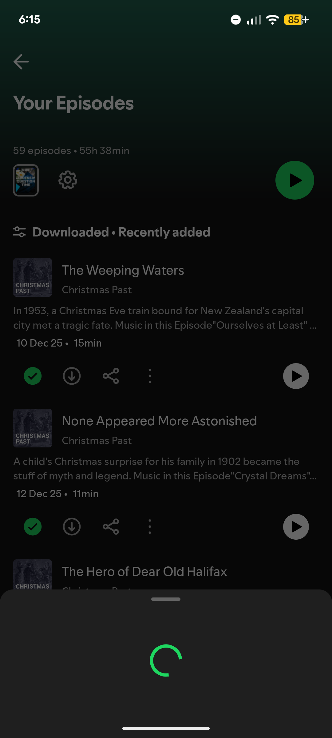
The first thing I usually do with Spotify when I open it is click Your Episodes. This is where the list of my podcast episodes that I've downloaded are displayed so I can listen. It's easily the most used page on the Spotify app for me, yet every time I click on it, I have to sit there and wait for a spinner that sometimes never ends.

What's frustrating about this is that it's so easily solved with a basic, widely used approach that could be Googled and implemented relatively quickly. And yet this issue has persisted for years.
All you have to do in this case is cache the list of "Your Episodes" every time you fetch it. This means saving a file to the phone with the list of episodes in it. Then, when a user clicks "Your Episodes", you read that list and show it immediately to the user while showing an indicator that you are fetching the full list.
This is a common approach on list pages for ecommerce and media sites. Usually, the user is seeking something from that list that was there last time they checked it. It's rare that they need the latest thing. So this algorithm instantly satisfies most users.
But that isn't even the most egregious case of this in the Spotify app: I dare you to try to add something to a playlist. The Spotify app shows a spinner and runs a web request when you try to open the three dots menu on a track.
Yes, it needs to hit the Spotify backend to show a menu.

This is embarrassing because not only is it strange to have to run a web request to get a menu, but it's strange that they aren't caching that menu. Even if customers see different menus, those customers can be grouped and the menus can be cached in some way.
The thing is, these usability issues aren't the only problems with Spotify as a whole. Spotify is notorious for not paying small artists, and Spotify pays artists less than Apple or Amazon.
So when you layer the usability issues on top of the structural issues with paying musicians, it's starting to become difficult for me to justify continuing to pay them $19.99 a month.
In closing, if anyone at Spotify sees this, let's talk: evanxmerz (at) yahoo (dot) com. This is a situation where it's so frustrating that I'd gladly solve it myself, or at least give the feedback to do so.
NOTE: I am a super user of music streaming services, so this is actually the third article like this that I've written. In 2016, I wrote a post about how Pandora makes discovery more difficult than I liked. In 2018, I wrote a somewhat similar article extolling the problems of using SoundCloud as a musician rather than a listener. Thanks for reading my opinions on music streamers. I used to be an Amazon Music subscriber, and I'll probably switch away from Spotify here soon, so I probably have a few more of these coming eventually.
