
The Android Camera app has usability problems
I recently decided to put up a web store to sell my art. It can be found at https://art.evanxmerz.com/.
Because I make art, I have to take a lot of pictures. I take pictures of my subjects while I am out hiking, then I take pictures of the artwork itself in order to showcase it online.
I use my camera a lot, so the fact that the camera app on Android is awful really bothers me. In this post, I'm going to list some of the usability issues with the Camera app, and present a quick mockup of how I would redesign the app.
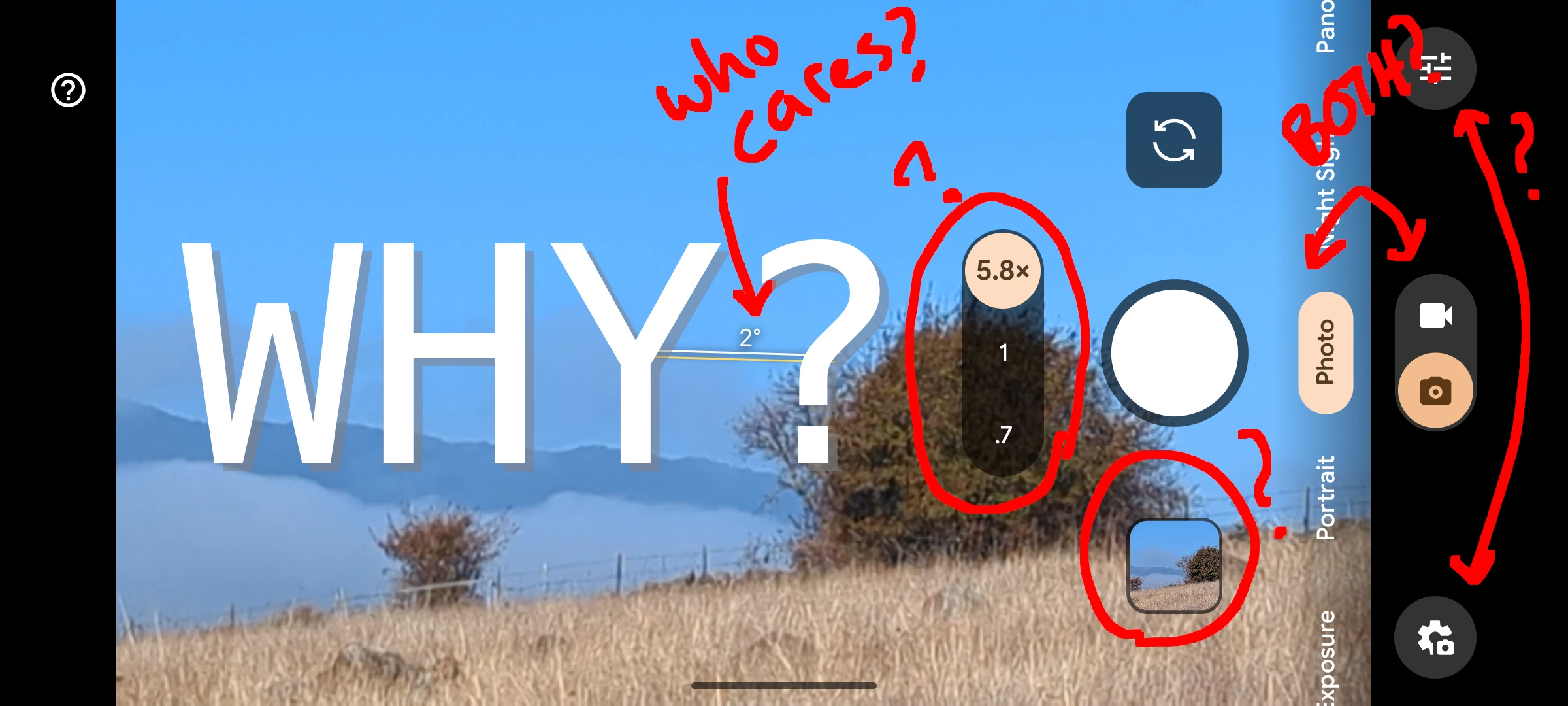
The most important part of the photo is covered by controls
The unforgivable sin of this app is that it's a camera app where the screen is blocked EXACTLY where you frequently want to put the subject of a photograph.
The most common composition guideline used by ALL photographers and visual artists is the rule of thirds. The rule of thirds tells artists to break their viewport into thirds, vertically and horizontally, then put the subject of the image at the breakpoints that divide each third of the image. This rule provides a quick way to lay out an image in a way that the human eye finds pleasing.
And where did Google put the zoom slider? Exactly on the boundary between the middle and rightmost third of the image. So, if you're trying to compose an image with the subject right at that spot, then you aren't going to be able to see the subject of your photo while taking the photo.
Rarely used controls take up valuable screen space
Why is there an angle measurement in the middle of the viewport? Does anyone really care if their photo is at 1 degree or 0 degrees? Does it really matter so much that it must be always visible?
Even worse is the mode selector. 99% of the time I use the camera app I am taking a photo. The other 1% of the time I am taking a video. There is a nice toggle that allows users to switch between photo and video modes. Then there is a slider that allows selection of photo modes such as panorama, portrait, and long exposure. Why is the photo mode selector using screen real estate all the time when it's used so rarely? This makes no sense.
Multiple controls that do similar things
Finally, there are multiple controls that do very similar things. Like, there are two separate buttons for camera settings. One is the familiar gear icon. It controls the Camera App settings. The other is the sliders icon. It controls the settings related to photography, such as brightness. Why do these need two separate buttons? Why can't the gear icon appear in the menu that opens when the slider icon is clicked? Or better yet, why not put the settings under the question mark icon on the left side?
And the other duplicated controls are the mode selector I mentioned above. The toggle for switching between photo and video modes is fine. Maybe add a long press if you want to open the other mode selector, but we don't need both selectors constantly open.
How I would redesign the Android Camera App
Redesigning any project is more challenging than it appears. It's easy for me to make a mockup that satisfies my needs. The reason those changes aren't immediately implemented is that there are many stakeholders who have concerns other than the usability of the product. That's understandable, but when the situation gets this bad, it's worth calling out.
Here's my 30 second mockup of a better user experience.
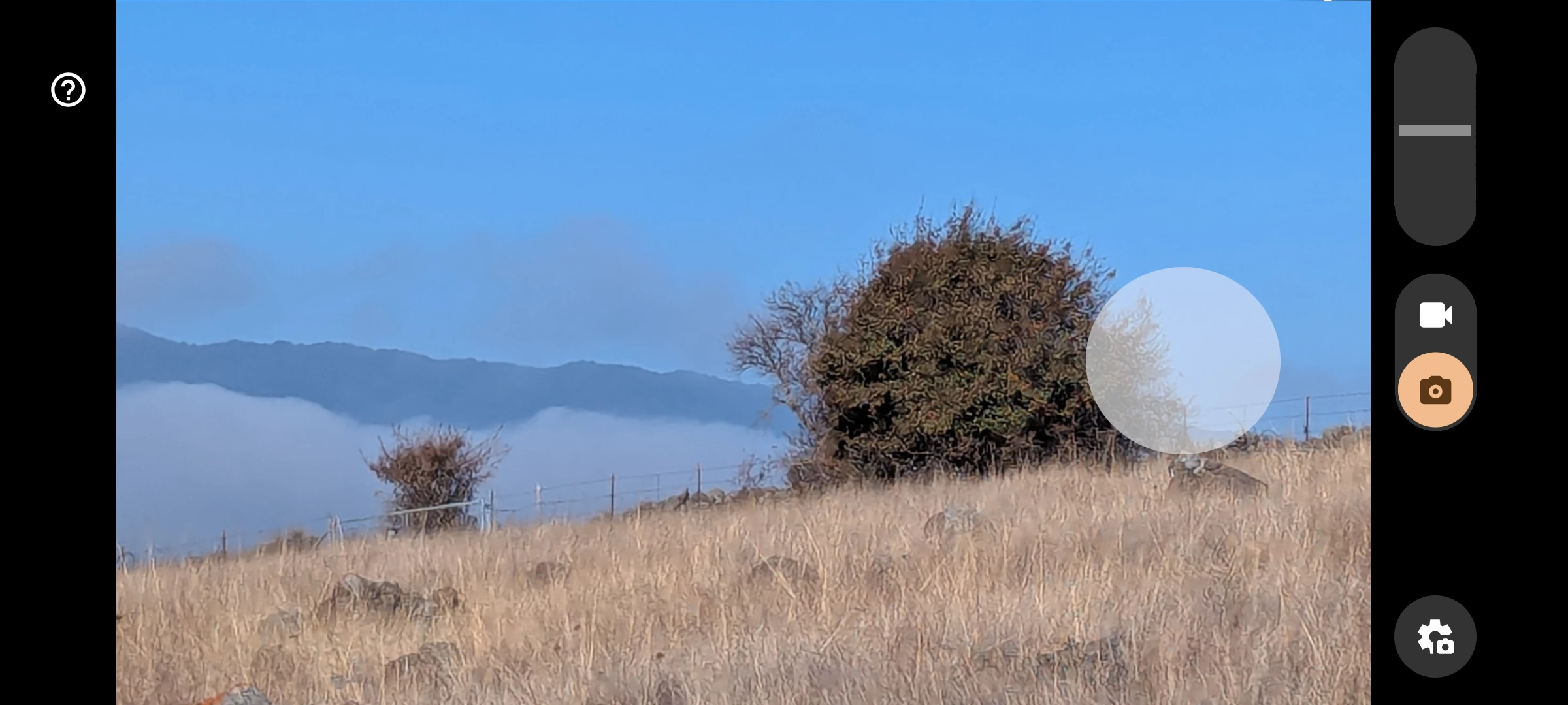
Notice that the camera button is transparent. Notice that there's nothing on the image itself except the button to take a picture. Notice that the zoom slider has been moved to the upper right and off of the actual image.
The result actually looks a lot more like the camera app user interface from 15 years ago! This type of experience decay is something I've written about before, and it plagues all experiences on the smart phone.