What are common mobile usability issues and how can you solve them?
In this article, I'm going to show you some common mobile usability issues reported by Google, and show you how to fix them using basic css.
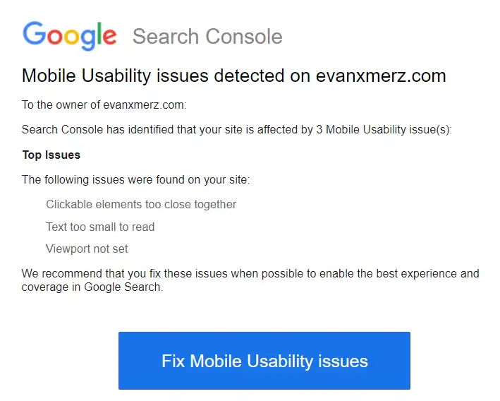
Mobile usability issues in Google Search Console
A few days ago I received this rather alarming email from Google.
I was surprised to see this, because, although my blog isn't the most beautiful blog on the web, I pride myself on the clarity for reading on any device. So I logged into Google Search Console and found the "Mobile Usability" link on the left side to get more information.
Search console gave me the same three issues.
- Viewport not set
- Text too small to read
- Clickable elements too close together
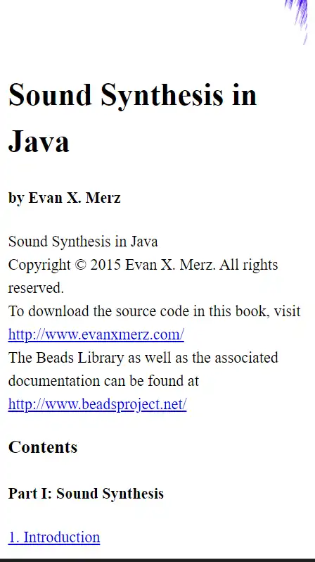
Search console said they were all coming from https://evanxmerz.com/soundsynthjava/Sound_Synth_Java.html. This url points at the file for my ebook Sound Synthesis in Java. This ebook was written using markup compatible with early generations of Kindle devices, so it's no surprise that Google doesn't like it.
When I opened the book on a simulated mobile device, I could see that the reported mobile usability issues were apparent.
Let's go through each of the issues and fix them one by one. This will require some elementary CSS and HTML, and I hope it shows how even basic coding skills can be valuable.
Viewport not set
Viewport is a meta tag that tells mobile devices how to interpret the page on a device. We need to provide it to give web browsers a basis for showing a beautiful page to viewers. In practical terms, this means that without a viewport meta tag, the fonts on the page will look very small to viewers on mobile devices because their browsers don't know how to scale the page.
To solve this issue, add this line to the html head section.
<meta name="viewport" content="width=device-width, initial-scale=1">
This may also solve the remaining issues, but we'll add some css for them just to be sure.
Add a CSS file
The following two fixes require us to use some css, so we will need to add a CSS file to our webpage.
Early kindles didn't support much css, so it was better to just format your books with vanilla html and let the Kindle apply formatting. That limitation doesn't apply to the web, though, so I created a file called styles.css in the same directory as my html file, and added this line within the head section of my html page. This tells the page to pull style information from the file called "styles.css".
<link rel="stylesheet" href="styles.css">
Next we need to add some style rules to fix the remaining mobile usability issues.
Text too small to read
Making the font larger is easy. We could do it for only mobile devices, but I think increasing the font size slightly will help all readers. The default font size is "1rem" so let's bump it up to 1.1 by adding the following code to our css file.
body {
	font-size: 1.1rem;
}
Clickable elements too close together
The only clickable elements in this document are links. So this means that the text is too small, and the lines are too close together. The previous two fixes might also address this issue, but just in case they don't, let's make the lines taller by adding another line to our body css.
body {
	font-size: 1.1rem;
	line-height: 1.5;
}
The default line-height is 1. By moving it to 1.5, we are making lines 50% taller. This should make it easier for users to click the correct link.
Putting it all together
In addition to solving the mobile usability issues from Google, I wanted to ensure a good reading experience on all devices, so here's my final set of rules for the body tag in my css file.
At the bottom I added rules for max-width, margin, and padding. The max-width rule is so that readers with wide monitors don't end up with lines of text going all the way across their screens. The margin rule is an old-fashioned way of horizontally centering an element. The padding rule tells the browser to leave a little space above, below, and beside the body element.
body {
	font-size: 1.1rem;
	line-height: 1.5;

	max-width: 800px;
	margin: 0 auto;
	padding: 10px;
}
When I opened up the result in a simulated mobile device, I could see that the issues were fixed.