
Revisiting my garden goals for 2025
Well, it's September of 2025 and the gardening season is coming to an end. It's just about time to begin cleaning up from 2025, and making plans for 2026. In fact, I'm starting to come up with goals for my 2026 season, so I figured that it was a good time to revisit my goals for 2025 and see how I did.
Spoiler: I didn't succeed with all of them.
1. Have success with full sized tomatoes
In 2025 I wanted to go over the top with full sized tomatoes for the first time in my gardening career. In years past, I had a mountain of success with cherry tomatoes, which are very easy to grow. And I harvested a few full sized tomatoes from plants in a few years. But I'd never been overwhelmed with tomatoes. In 2025 I wanted to be giving away tomatoes to my neighbors.
So I listened to Farmer Fred's annual tomato show where he and Dan Shor discuss the tomato varieties that they're excited about. I picked three varieties that they discussed: Rugby, San Marzano, and Bush Early Girl. I started those from seed. Then I was gifted a fourth variety from a friend. It was Chef's Choice Black, I think.
I'm proud to report that my tomatoes were an overwhelming success this year. I had so many tomatoes that Erin made tomato soup, tomato ketchup, and tomato sauce. Even after all that, we were still giving bags of tomatoes away to neighbors.
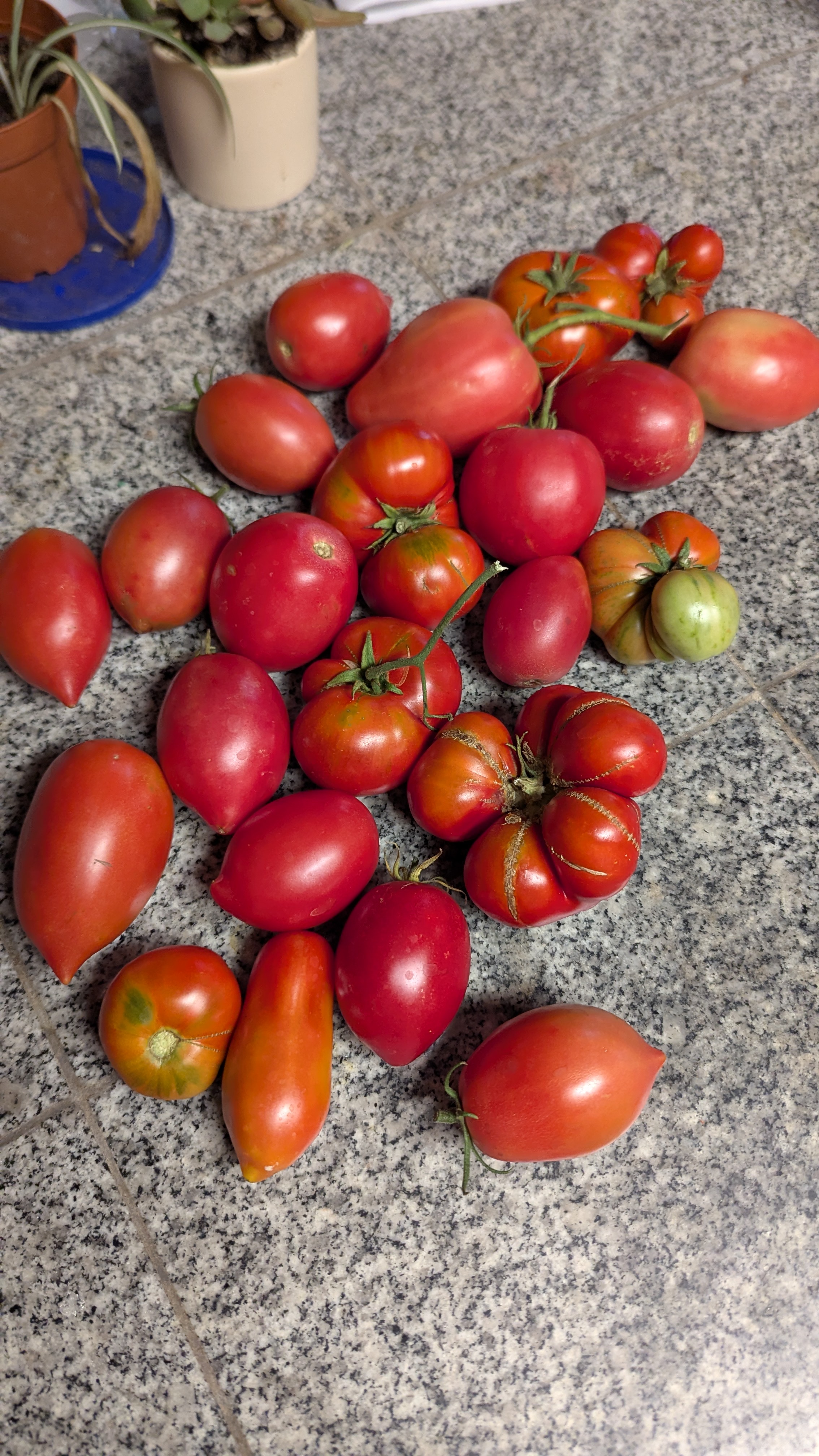
Still, it wasn't a universal success. My tomatoes in the ground did great, but my tomatoes in containers were pretty disappointing. Maybe next year I will give a little more thought to the varieties I put in containers and how I care for them.
VERDICT: SUCCESS!
2. Have success growing cucumbers
I had the exact same goal with cucumbers. I'd grown cucumbers in the past, but they generally produced very few fruit that weren't very tasty. This year I wanted to be swimming in cucumbers.
So what did I do?
Well, I started my cucumbers from seed a little early in the season. I started more plants than I thought I needed, and ultimately I put six of them into the ground about two weeks before it was recommended because they were out-growing their containers.
Then I watered every day and built trellises from sticks I had laying around.
And let me tell you, we ate cucumbers until we were tired of them. I think I ate cucumber sandwiches for every lunch for a month. I was forcing the kids to eat cucumber sandwiches, too. It was definitely the best cucumber harvest I've ever experienced, and it was a lot of fun.
VERDICT: SUCCESS!
3. Grow eggplant for the first time
Every year I try to grow something that I've never grown before. This year I tried eggplant. I grew the heirloom variety Black Beauty from seed, and transplanted three eggplants into containers a few weeks after I put my tomatoes in.
But I made several mistakes.
First, I put two eggplant bushes into one container. It is one of my largest containers, but I see now that eggplants are such heavy feeders that they can't share space with another eggplant.
Second, I put the third eggplant in a container that was too far from my door. This led to me underwatering it, and it only producing a single fruit.
The problem with crowding my eggplants together was that the eggplants never reached full size. So I never noticed that they were coming into ripeness at a smaller size, and I let almost all of them become bitter and overripe.
Erin was a trooper and she still made eggplant parmesan from the few good looking ones that we harvested, but even those were a bit overripe.
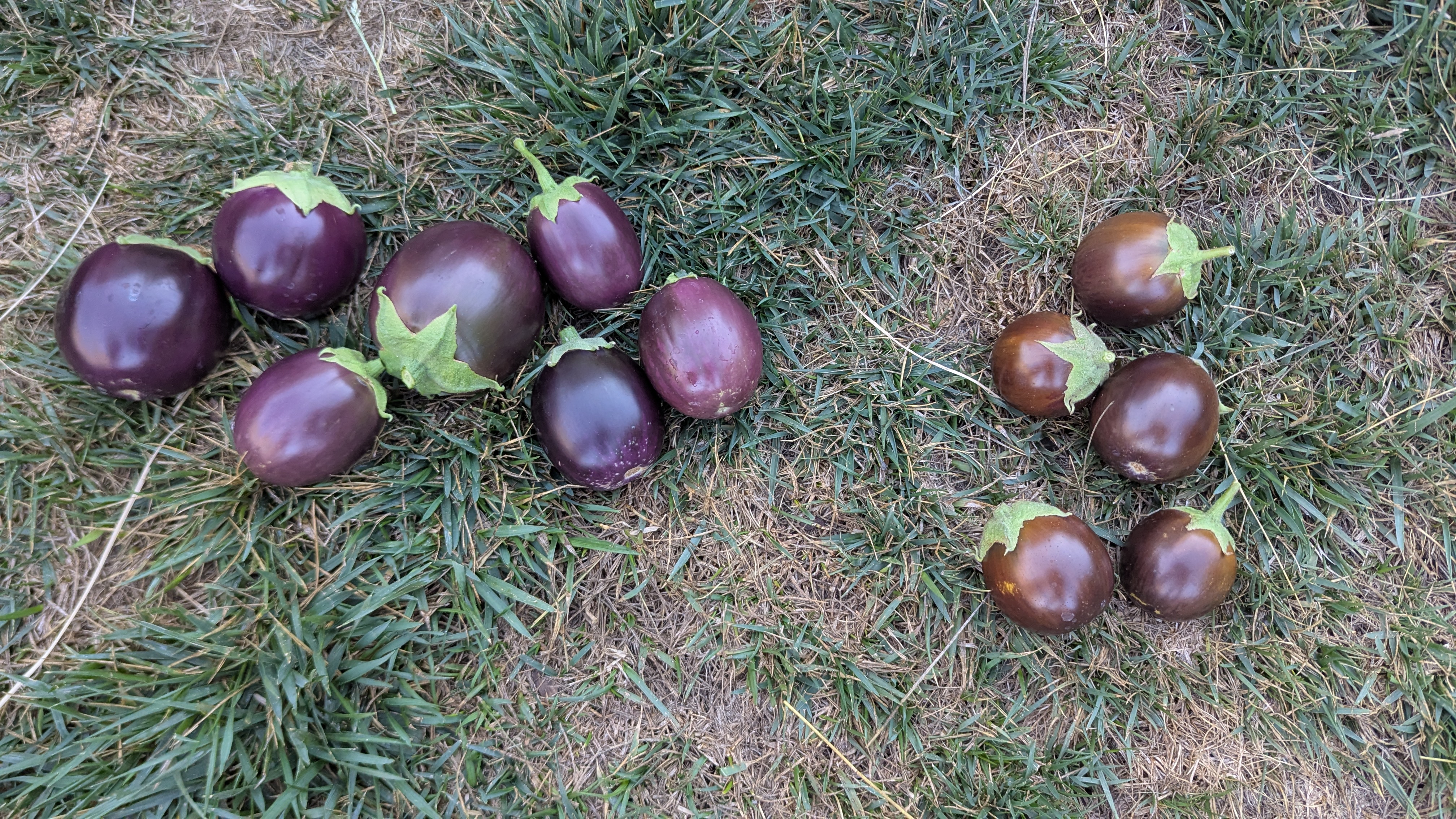
So I failed at my first time growing eggplant, but that's how it usually goes when you grow something for the first time. In a way, I expected to fail. Failing at growing eggplants this year makes it much more likely that I will succeed at growing them next year.
VERDICT: FAIL!
4. Propagate more native plants
Last year I had a small success with native plant propagation. I collected seeds from California Buckeyes and grew them in containers. When some of my friends had a planting project in the spring where they needed trees, I was fortunate to be able to step in and give them around 10 California Buckeye saplings.
This year I wanted to repear that success, but with several different varieties of plants. I wanted to grow oak, toyon, sagebrush, and Roger's Red Grape.
I collected seeds conservatively from local parks, only taking one or two from each plant. Then I cold stratified the oak acorns over the winter and planted them in the spring. I'm pleased to report that I have around 10 oak seedlings growing in containers in my backyard right now.
I also have around 10 toyon, 5 or 6 native grapes, and around 10 containers of native irises. In fact, I'm most proud of the irises because I had to divide irises on my own for the first time.
Still, I wasn't successful with all the plants that I wanted to propagate. I wanted to propagate sagebrush by cutting, but I failed at every attempt. I'm going to ask a friendly local native plant expert about how she propagates sagebrush and give it another go.
VERDICT: SUCCESS!
5. Grow Dan Tucker pumpkins
In 2024 I thought about buying a cabin outside the city. In fact, this is something I'm still working on. I'm tired of living in the city. I want to have a big garden and grow lots of fruit trees. So I started visiting cabins on a few acres of land in 2024.
At one such cabin, I met a man named Dan Tucker. He showed me all around his beautiful property. We talked about his career as an organic farmer in Texas. We talked about his cancer diagnosis. I told him about wanting to get out of the city and away from the traffic. He showed me where salmon swim upstream on a creek nearby, and where the rare native flowers grow.
I loved his place, but I didn't have the money to give him the most competitive offer. It's no surprise that he sold to someone else.
Still, before I left that day he gave me some seeds. They were pumpkin seeds that he bred by crossing Mother Hubbard and Speckled Hound varieties, and I'm going to call the result Dan Tucker Pumpkins in his honor.
So how did I do growing them? Well, I tried to start them in the ground twice and failed both times. By that point it was quite late to start more pumpkins, but I couldn't just give up on them. So I started more in a cup, and just when they were ready to go in the ground I had to fly across the country. I asked a neighbor to water them but I still lost 2 out of 3.
Still, there is one growing in my front yard, and it has a few female flowers that I'm hoping were pollinated successfully. I still won't know for a few more weeks if I've had success with this one or not, but I'm hoping that I will get at least one funky looking pumpkin from all this effort.
VERDICT: TBD!
The problem with smart phones
Smart phones seemed like a great idea in 2007. Wouldn't it be cool to have a device in your pocket that did everything? A palm sized device that connected you to the entire world?
And obviously, the world agreed to some degree. Cell phones are ubiquitous. They are signifiers of identity. They are connections to culture, family, and work. They are maps, emergency calls, music players, planners, secretaries, and tools for intense discussions about anything you care about.
But in 2024, the idea of the smart phone doesn't seem so smart to me.
I remember in the mid 2010s when a small but vocal group of people said that cell phones were a fad. That cell phones would come and go. That they were a fashion craze like Jordan sneakers or horn rimmed glasses or skinny jeans. I work in tech, so I remember thinking that those people were crazy and out of touch. Cell phones were, very clearly to me at the time, the way of the future. So how could anyone possibly think that they were a fad?
Well, I think it's time to acknowledge that smart phones are a design failure in many respects.

One device that does everything. One point of failure.
On Monday, November 18th, 2024, I RTOed. I Returned-To-Office. I transferred to a new position within the company I work for and I transferred back to the office. On Monday it all went relatively well. The traffic wasn't too bad, and I enjoyed seeing everyone in person.
On Tuesday, November 19th, 2024, I dropped my phone while getting out of my car in the work parking lot.
I hardly need to elaborate on this fact, because everyone knows what this implies. My screen shattered and I was instantly plunged into darkness. I couldn't text anyone. I couldn't check my email. I had to drive to places on memory. Worst of all, I lost access to my calendar.
Could I make it to an event on Sunday? I literally had no idea until I could get to a computer to pull up my Google Calendar.
When you run your life from one device, you have one point of failure. If that one thing breaks, then you lose everything. I lost my podcasts, the entertainment for my commute. I lost my music for my morning runs. I lost my calendar. I lost my group text threads. I lost social media, because my two factor auth was tied to my phone.
I have insurance on my phone, but I thought it was wasteful to replace the phone. I decided to wait for the shop to get the single part that I needed to replace - the screen. So I lost all this for around a week, and I still don't have a personal phone as I write this.
I wish I had a camera separate from my phone. I wish I had a music player separate from my phone. I wish I had a paper planner. Why was I keeping everything on one device?
Always connected and always available.
As I get older, I find that the best and worst aspects of something are often the same thing. This is definitely true in the case of cell phones.
Cell phones have a data connection that is always available. At any time you can access Wikipedia and Google and Facebook and your family. At any abritrary time you can access everything that is out there in the wide world.
But the connection goes both ways. The world can also access you at any time.
I know I'm not alone when I say that I don't want to be available all the time.
I don't want my work to be able to contact me when I'm eating dinner. I don't want to get notifications about whatever insane thing Trump did when I'm out for a run. I don't want my phone to vibrate when I'm taking a picture.
Jack of all trades. Master of none.
And this gets to the heart of the issue.
Cell phones do everything poorly. The experience sucks.
Do I really need layers of privacy on my music player? Do I really want social sharing built into my camera? Do you think that being able to take Zoom calls from the park is a good thing?
There are just so many spurious layers on all experiences on the cell phone.
For instance, to take a picture on my phone I need to wake the phone up by pressing a button, then swipe up to bring up the login, then enter my pin, then pull up the camera app, then dismiss the notification about my storage being full. Then I can finally take a picture.
You don't even need to turn on an analog camera. Just point and click. Even a digital camera is just pressing the button once to wake it up, then pressing it again to take a picture.
And don't get me started on music players that need to be connected to the internet. Just... why?
It's good to change. It's good to learn from your mistakes.
Our society hates moving backward. We hate changing our minds or trying another path.
But why?
I think it's good to grow and learn. I think it's good to admit when you make a mistake AND LEARN FROM THAT MISTAKE. I think it's good to look at your choices critically and ask yourself whether you could do something different or better.
So I am re-evaluating the whole concept of a cell phone. I miss my old, dumb, mp3 player. I miss my paper calendar / organizer. I miss my digital camera.
For now, I will wait for them to replace the screen on my phone.
But I am starting to wonder if the people who called cell phones a fad were right.
Fall and winter are for composting in place
In California, we are constantly struggling with space limitations. If you're an urban gardener like me, then you might be working with as little as a tenth of an acre. This can make composting somewhat difficult. It's hard to find space for multiple compost piles. Fortunately, there is a much easier way to improve your soil that requires no dedicated space in your yard.
What is composting in place?
Composting in place means composting in the place where you intend to grow plants. It means composting directly in the soil, rather than composting in a bin then applying the compost to the soil.
Composting in place has the advantages of requiring no extra space, and requiring very little time or effort. The drawback is that you have to dig up the spot where you want to compost, so you can't have anything growing there at the time. For that reason, composting in place is generally a fall or winter activity.
Composting in place is a great way to improve your soil without having to set up a compost bin, or learn how to turn it, or learn about greens and browns.
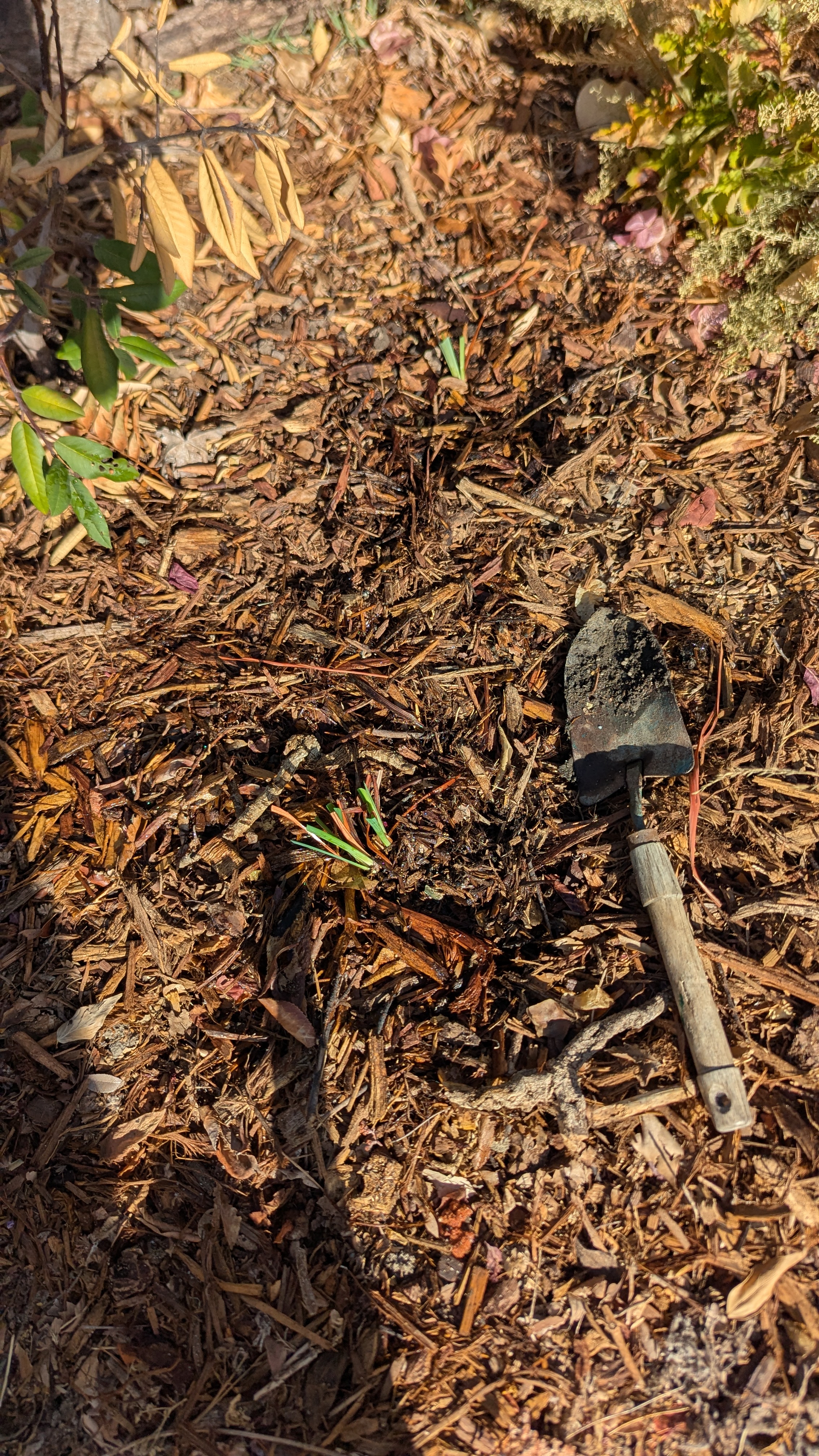
How to compost in place
Composting in place is exceptionally easy, but it takes around a month or more for the process to complete, so it's really only something to do in fall or winter.
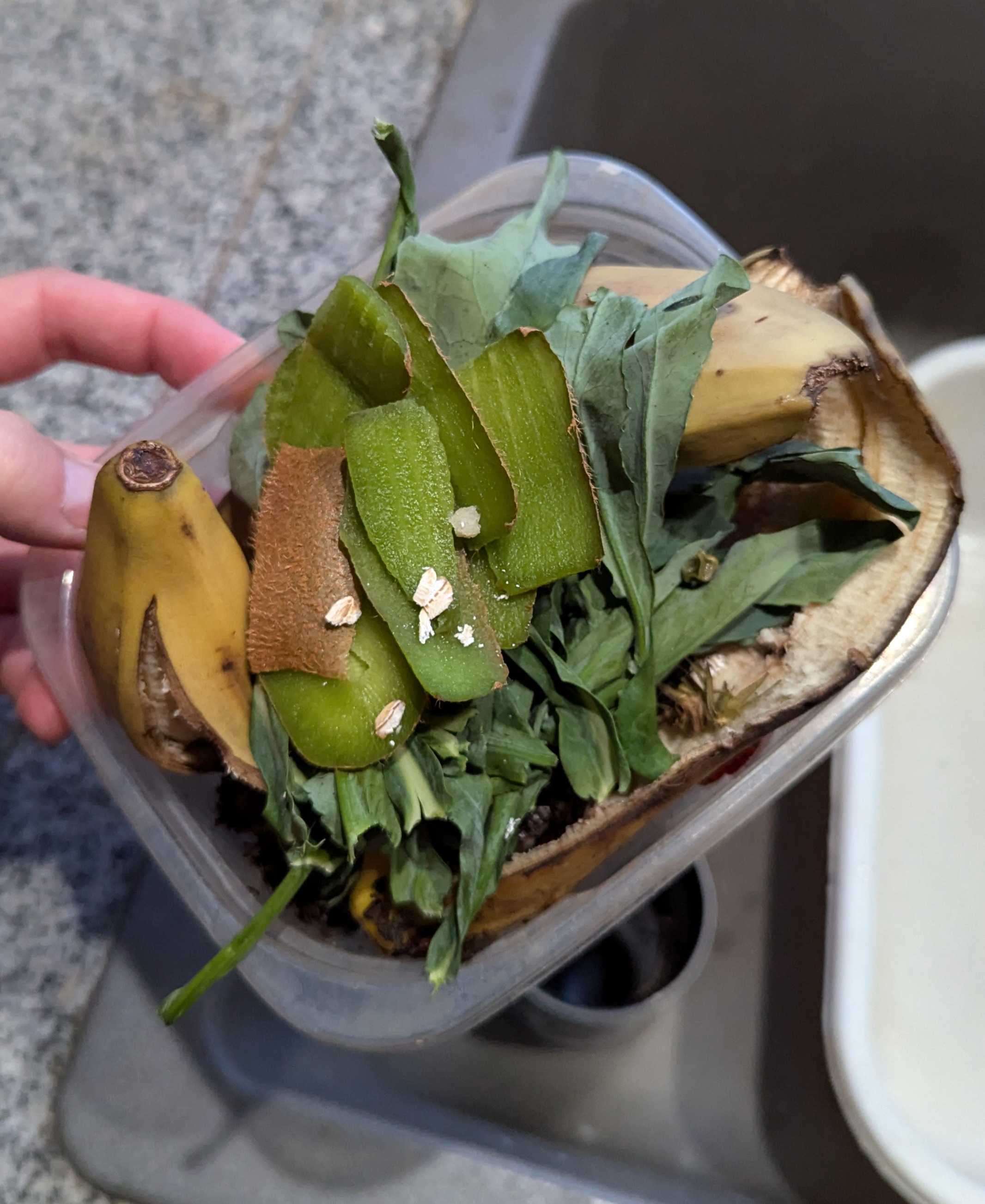
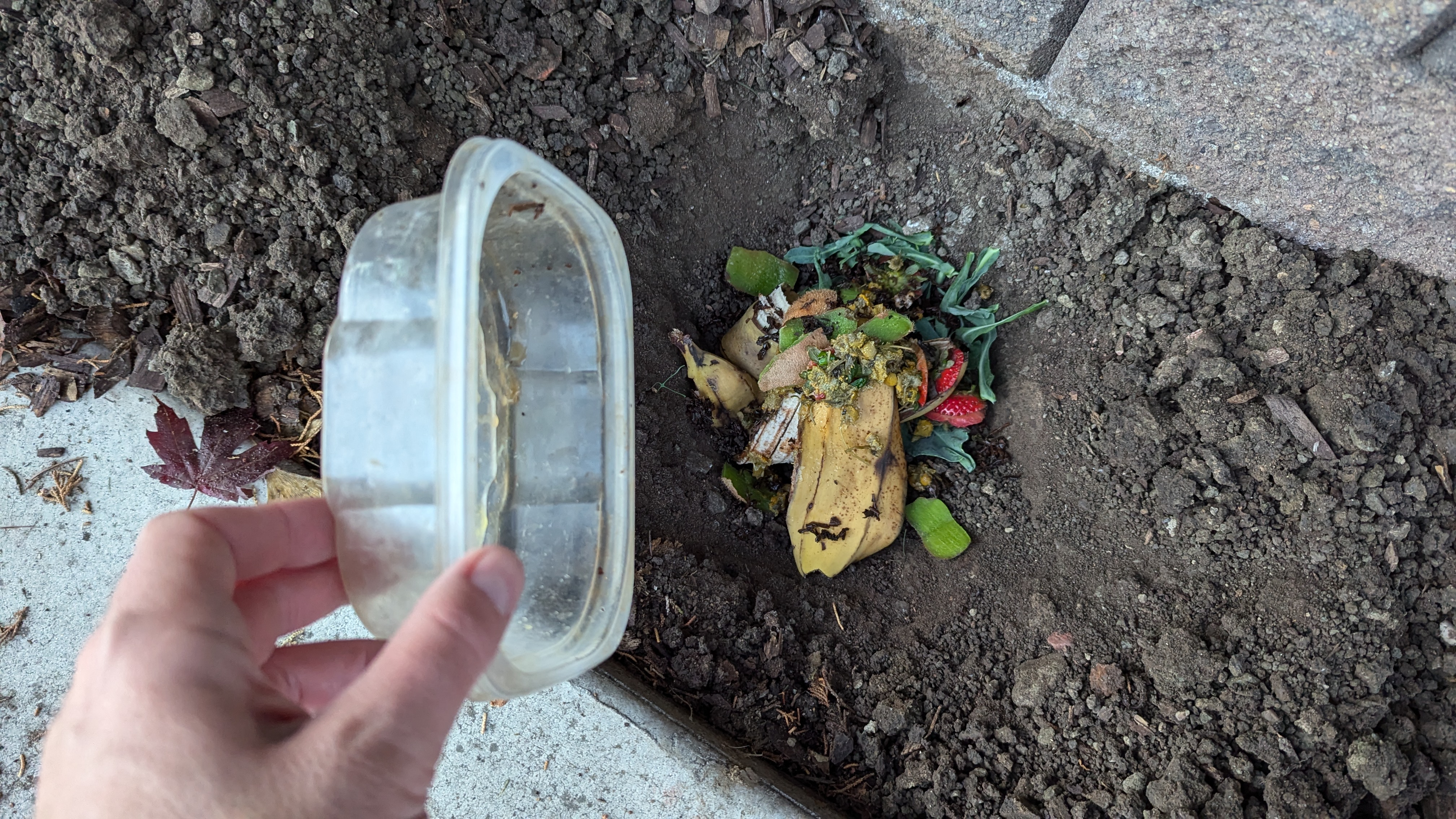
- Gather kitchen scraps. My partner and I keep a container near the sink and drop all our waste plant material into it. Most of the time that material goes into our regular compost bin, but in the fall and winter I try to bury as much of it as I can.
-
Identify a place in your yard where you want to improve the soil for planting in the spring. In my yard I have a long narrow strap of soil between my driveway and my neighbor's fence. I use it for planting flowers mostly.
-
Dig a hole around 12 inches deep.
-
Dump your kitchen scraps in the hole.
-
Cover the kitchen scraps with the removed soil and mulch.
-
Wait around a month.
There are just a few things to be careful of. First, don't bury animal products this way unless you understand the risks of attracting animals. Second, this will only work in non-frozen soil. So it works great in the fall and winter for most of California, but it's not great in places where the soil freezes. Finally, be careful about doing this in the late winter or spring, as you need to give the soil food web enough time to turn the food scraps into compost.
So get out there and start improving your soil while the weather is good! This is a great garden activity that you can repeat every day in the slow seasons.
You should plant a California Buckeye in your California garden
It can be difficult to get started with native plants. There are so many questions. What plants are native? Where can I get native plants? How do I care for native plants? Why is it important to plant them?
The answers to all these questions are complex, but starting with native plants doesn't have to be. In fact, there are some native plants that you can start for free, and require little to no care to propagate.
In this post, I'm going to tell you why you should plant California Buckeye, and how to do so for absolutely no cost.
Why to plant California Buckeye
California Buckeye is a fantastic tree or large bush for California gardens because it is compact, well suited to most of the state, and great for native pollinators.
1. California Buckeyes are beautiful
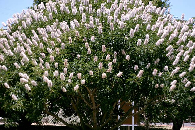
In spring the California Buckeye grows beautiful tall white flowers that look a bit like candles. They tend to attract lots of butterflies, so they put on a great show.
2. California Buckeyes are perfectly sized for small yards
California Buckeye is not a large tree. Most California Buckeye I've seen are between 8 and 12 feet tall, and about as wide. When you see them in a thriving native forest, they may grow up to 40 feet tall, but that is exceptionally rare.
3. California Buckeyes require virtually no care
Are you tired of irrigating your trees? California Buckeyes are native to California, so they are perfectly adapted to the climate here. They only need water at the times of year when we get it. They start dropping their leaves in the summer in order to ensure that they don't waste water.
4. California Buckeyes are easy to grow from seed
California Buckeye grows readily from seed. Just collect the enormous pods in the fall or winter, place them in a pot, and when they're taller than a foot, transplant them into your yard. They don't require any special attention if you just leave the container outside to get the normal amount of water we get in the winter.
5. California Buckeye is a great replacement for small non-native trees
California Buckeye is a perfect replacement for non-native Crepe Myrtles and Japanese Maples.
I know you have seen streets lined with Crepe Myrtles. Yeah, they look beautiful occasionally, but do you ever see them swarmed with pollinators? No, because Crepe Myrtles aren't native to California. While they are well suited to the climate here, they are just pretty trees that do nothing for the local wildlife. California Buckeyes will grow to about the same size as Crepe Myrtles, they put on very similarly shaped flowers, and they will support local pollinators.
The same thing goes for Japanese Maples, except Japanese Maples aren't even well suited to the climate in California. Japanese Maples are understory trees that need a fair bit of water, and prefer to grow in the shade of other trees. They only thrive in California if they are given artificial irrigation from water that is wasted on non-native trees in spots where native trees would require none. California Buckeyes will grow to roughly the same size as Japanese Maples, and they will require no supplemental irrigation.
How to plant California Buckeye
Possibly the best thing about California Buckeyes is how easy they are to grow.
- Collect the seed from a tree in fall or winter.
- Put it in the ground where you want a tree (in fall, winter, or early spring).
- Wait.
I've grown several California Buckeyes from seed, so I know it's possible to be successful just by dropping the enormous seed in the ground, but you can also start them in large-ish containers then transplant them into the ground in a year.
Here are a few other things I do when propagating California Buckeyes.
1. Collect the seed directly from the trees right before they drop
California Buckeyes have absolutely massive seeds. They are just a little bit smaller than baseballs. So they are easy to collect. I don't think I've ever had one that failed to come up, but I always plant a few extra to ensure I get what I want. If you want one tree, then collect three seeds.
Here's what the pods look like when they are ready for collection.
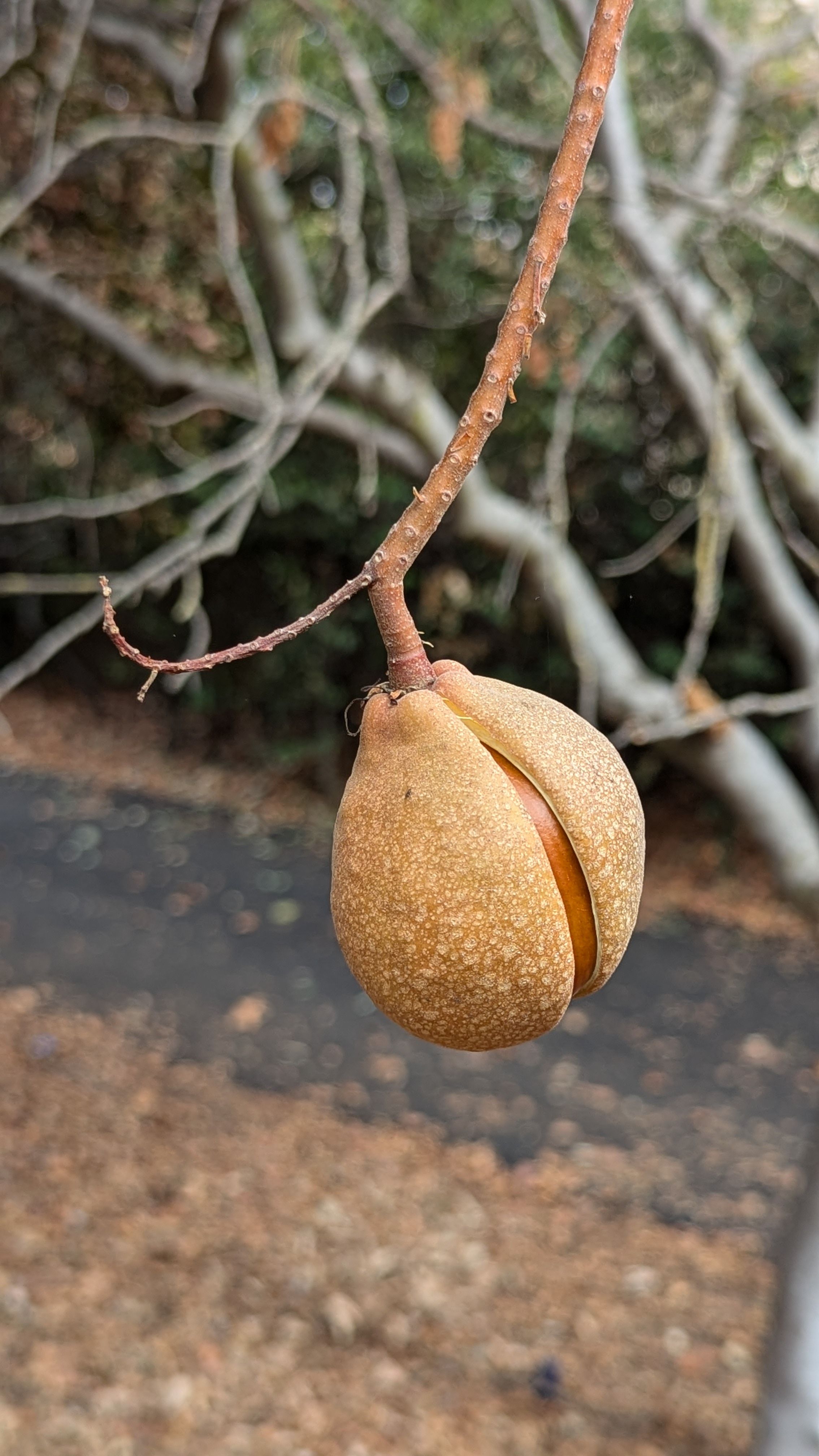
I should say that you should get permission from your local trail or park before you gather seeds, but I don't know any wildlife that depend on the seeds (squirrels eat them, but they are toxic to most other wildlife), and I've never seen a tree that doesn't produce a mountain of seed. You only need one, and you are going to make more native plants.
2. Drop them in containers when you pull out your tomatoes
Are your tomatoes done for the year? It's time to pull them out. But what do you do with the soil? Tomatoes are such heavy feeders that it's difficult to reuse the soil.
But that's the perfect time of year to gather California Buckeye seeds and put them in the ground. Because they don't mind growing in poor soil, they will readily sprout in containers where tomatoes have been grown.
3. Don't worry about water
Unless you're in the desert, then the seed won't need any more water than nature provides. Just leave the container outside and forget about it. When the tree is transplanted into its final location (in the following fall probably) then you should make sure to water it regularly for the first few weeks until the rainy season begins in earnest.
Start today
So what are you waiting for? The seeds are falling from the trees in fall and winter. Go ahead and pull out your irrigation system, pull out that non-native tree, and drop in the seed for a California Buckeye. With very little work, you will reap the rewards of one of many beautiful trees that come from California.
More information
New realtor rule makes it harder for young people to enter the housing market
I sometimes consider changing the name of my blog to "the oldest millenial" because I was born in 1981, which is usually considered the start of the millenial generation. Sometimes people put the start of the millenial generation in 1982, but in either case, I mostly sympathize with millenials so I consider myself an old millenial rather than a young Gen-Xer.
My point is that I'm not young, but I'm young enough to see how much the elder generations have hurt young people. Stagnant wages, rising college prices, burning fossil fuels, and the shredding of the social safety net mean that everyone younger than the boomers has a far more difficult time finding success in life than the boomers did.
So when I learned about the rule changes coming from realtors, it struck a familiar chord. I don't know what the realtors are calling the new rule, so I'm going to call it the "Treat Young People Like ATMs Rule of 2024".
Who are realtors?
Realtors are a professional organization of salespeople who facilitate home sales. They aren't a part of the government. They aren't even a necessary or required part of the home buying process. They are simply salespeople who have banded together in an organized way.
They ostensibly make buying homes easier, but they have a mixed reputation, to say the least. Still, they are usually involved in both sides of any home sale. Both the buyer and the seller each hire an agent and they work together to help the buyer and seller achieve their goals.
The basic dynamics of the arrangement aren't changing.
The Treat Young People Like ATMs Rule of 2024
So what IS changing?
In the past, the fee for each agent came out of the seller's end. Each agent recieved around 2.5% to 3% of the sale price as their fee. So the seller would make 5% to 6% less than the sale price because that amount would go to the agents.
The new rule forces the buyer to pay the fee for the buyer's agent. It also forces the buyer to sign contracts that require them to work with and pay a specific agent.
How does this hurt young people?
Now, in a fair world, this could be seen as fair play. The seller pays the seller agent fees and the buyer pays the buyer agent fees. Fair enough, right?
But context matters.
The context of this rule change is that the people who own homes today didn't have to pay the buyer's agent fees when they bought their homes.
Now, in addition to the 10% to 20% downpayment that first time home buyers must accumulate, they must accumulate an additional 3% to pay their agent. Adding the additional 3% on the buyer means that more young people will be locked out of home ownership even longer.
It also means that homeowners will take a larger share of the pie. It's a wealth transfer from young, non-wealthy people, to old, wealthy people. Yet again, the older generation, rather than helping young people, is changing the rules in order to steal from them.
What's the point?
So why make this rule at all?
It's difficult for me to understand why this rule exists.
It will have the impact of artificially making housing prices look lower than they really are. This will confuse first time buyers.
It will have the impact of allowing home owners to take a larger share of the pie. This is the part where they're using young people like ATMs.
It will also make it easier for investors and the wealthy to scoop up homes at prices that first time home buyers can't afford.
It may temporarily prop up a housing market that is clearly heading for an "adjustment".
Shopping shouldn't be a contractual process
But the weirdest thing about this law, beyond the predictable greed, is that it makes shopping a contractual process. It forces people who want to buy a home to sign a confusing contract that locks them into fees with an agent who, in many cases, adds very little value to the process.
The realtors, as a professional organization, have clearly overstepped what any rational person would consider reasonable. Shopping shouldn't be contractual, and it's unfair to place even more of a burden on first time home buyers and young people.
When did this become okay?
When did older generations start seeing young people as their ATMs? When did older generations switch from supporting younger generations to stealing from them?
The greed embodied in credit scores, stagnant minimum wage, and this new rule is staggering. (Not to mention the unsustainable burning of fossil fuels, which is increasingly hard to ignore.)
As of this writing, I'm 42 years old. I don't consider myself an old person, but as I said at the beginning of this rant, I'm an old millenial. And frankly, I'm ashamed of everyone over the age of 40. How can any older person support putting more of a burden on young people, especially when it comes to housing?
I think that we're turning a corner on many of the issues mentioned in this rant, but regressive policy changes like this are a step in the wrong direction.